seaborn.jointplot
seaborn.jointplot(x, y, data=None, kind='scatter', stat_func=None, color=None, height=6, ratio=5, space=0.2, dropna=True, xlim=None, ylim=None, joint_kws=None, marginal_kws=None, annot_kws=None, **kwargs)
Draw a plot of two variables with bivariate and univariate graphs.
This function provides a convenient interface to the JointGrid class, with several canned plot kinds. This is intended to be a fairly lightweight wrapper; if you need more flexibility, you should use JointGrid directly.
参数:x, y:strings or vectors
Data or names of variables in
data.
data:DataFrame, optional
DataFrame when
xandyare variable names.
kind:{ “scatter” | “reg” | “resid” | “kde” | “hex” }, optional
Kind of plot to draw.
stat_func:callable or None, optional
Deprecated
color:matplotlib color, optional
Color used for the plot elements.
height:numeric, optional
Size of the figure (it will be square).
ratio:numeric, optional
Ratio of joint axes height to marginal axes height.
space:numeric, optional
Space between the joint and marginal axes
dropna:bool, optional
If True, remove observations that are missing from
xandy.
{x, y}lim:two-tuples, optional
Axis limits to set before plotting.
{joint, marginal, annot}_kws:dicts, optional
Additional keyword arguments for the plot components.
kwargs:key, value pairings
Additional keyword arguments are passed to the function used to draw the plot on the joint Axes, superseding items in the
joint_kwsdictionary.
返回值:grid:JointGrid
JointGridobject with the plot on it.
See also
The Grid class used for drawing this plot. Use it directly if you need more flexibility.
Examples
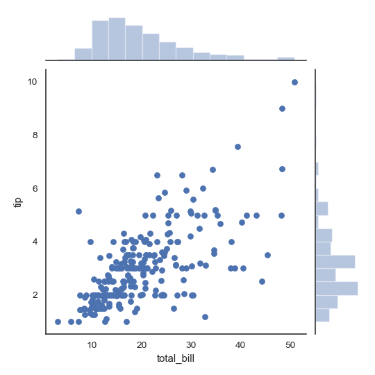
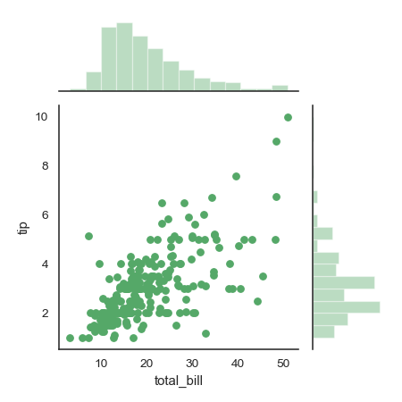
Draw a scatterplot with marginal histograms:
>>> import numpy as np, pandas as pd; np.random.seed(0)
>>> import seaborn as sns; sns.set(style="white", color_codes=True)
>>> tips = sns.load_dataset("tips")
>>> g = sns.jointplot(x="total_bill", y="tip", data=tips)
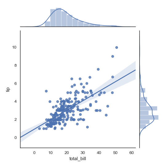
Add regression and kernel density fits:
>>> g = sns.jointplot("total_bill", "tip", data=tips, kind="reg")
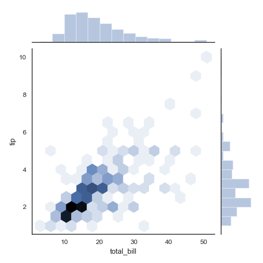
Replace the scatterplot with a joint histogram using hexagonal bins:
>>> g = sns.jointplot("total_bill", "tip", data=tips, kind="hex")
Replace the scatterplots and histograms with density estimates and align the marginal Axes tightly with the joint Axes:
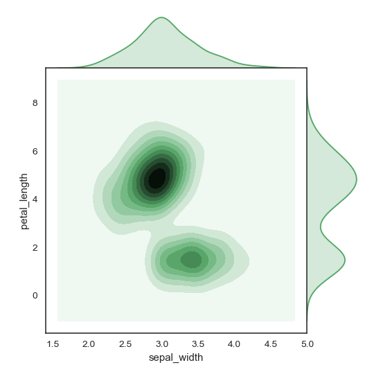
>>> iris = sns.load_dataset("iris")
>>> g = sns.jointplot("sepal_width", "petal_length", data=iris,
...                   kind="kde", space=0, color="g")
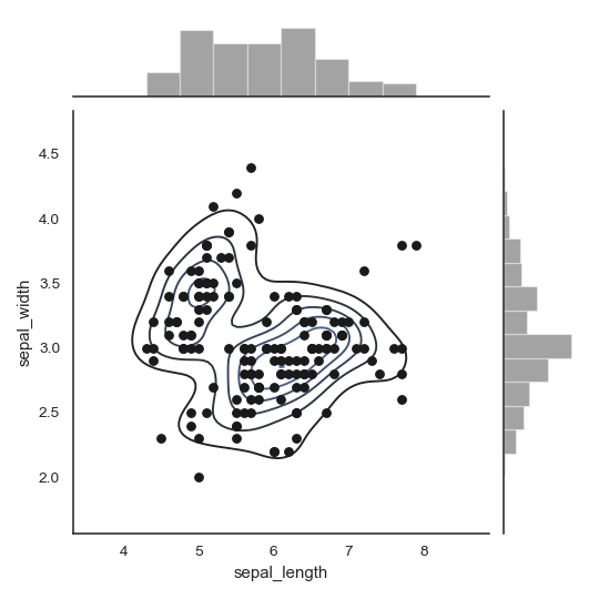
Draw a scatterplot, then add a joint density estimate:
>>> g = (sns.jointplot("sepal_length", "sepal_width",
...                    data=iris, color="k")
...         .plot_joint(sns.kdeplot, zorder=0, n_levels=6))
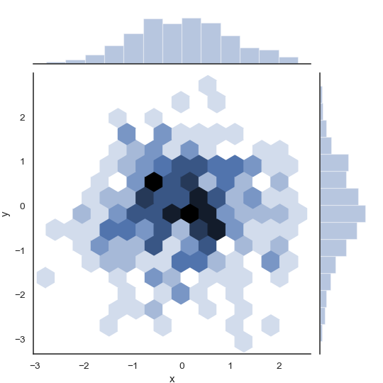
Pass vectors in directly without using Pandas, then name the axes:
>>> x, y = np.random.randn(2, 300)
>>> g = (sns.jointplot(x, y, kind="hex")
...         .set_axis_labels("x", "y"))
Draw a smaller figure with more space devoted to the marginal plots:
>>> g = sns.jointplot("total_bill", "tip", data=tips,
...                   height=5, ratio=3, color="g")
Pass keyword arguments down to the underlying plots:
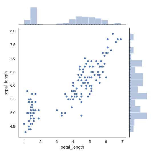
>>> g = sns.jointplot("petal_length", "sepal_length", data=iris,
...                   marginal_kws=dict(bins=15, rug=True),
...                   annot_kws=dict(stat="r"),
...                   s=40, edgecolor="w", linewidth=1)